UX / UI Design
A banking app for minimalists
UI Design | Solo Project | 6 weeks

The Challenge
Designing a minimum viable product for a new bank, based on provided wireframes, user personas and a client brief. Some initial research was included which allowed me to start my own targeted desktop research.
Approach
Using what information had been provided - the low fidelity wireframes, and some user personas - I used the goals and pain points to ensure the functinality of the app would leave users with what they needed. The themes that came out of the initial research identified users wanted to feel confident and in control of their finances. A moodboard set the tone for the visuals, and a User Flow mapped out all the screens I needed to consider.


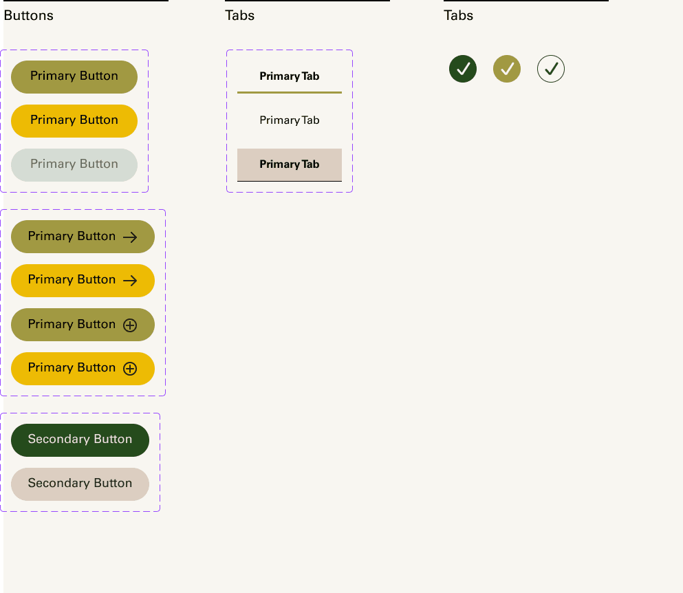
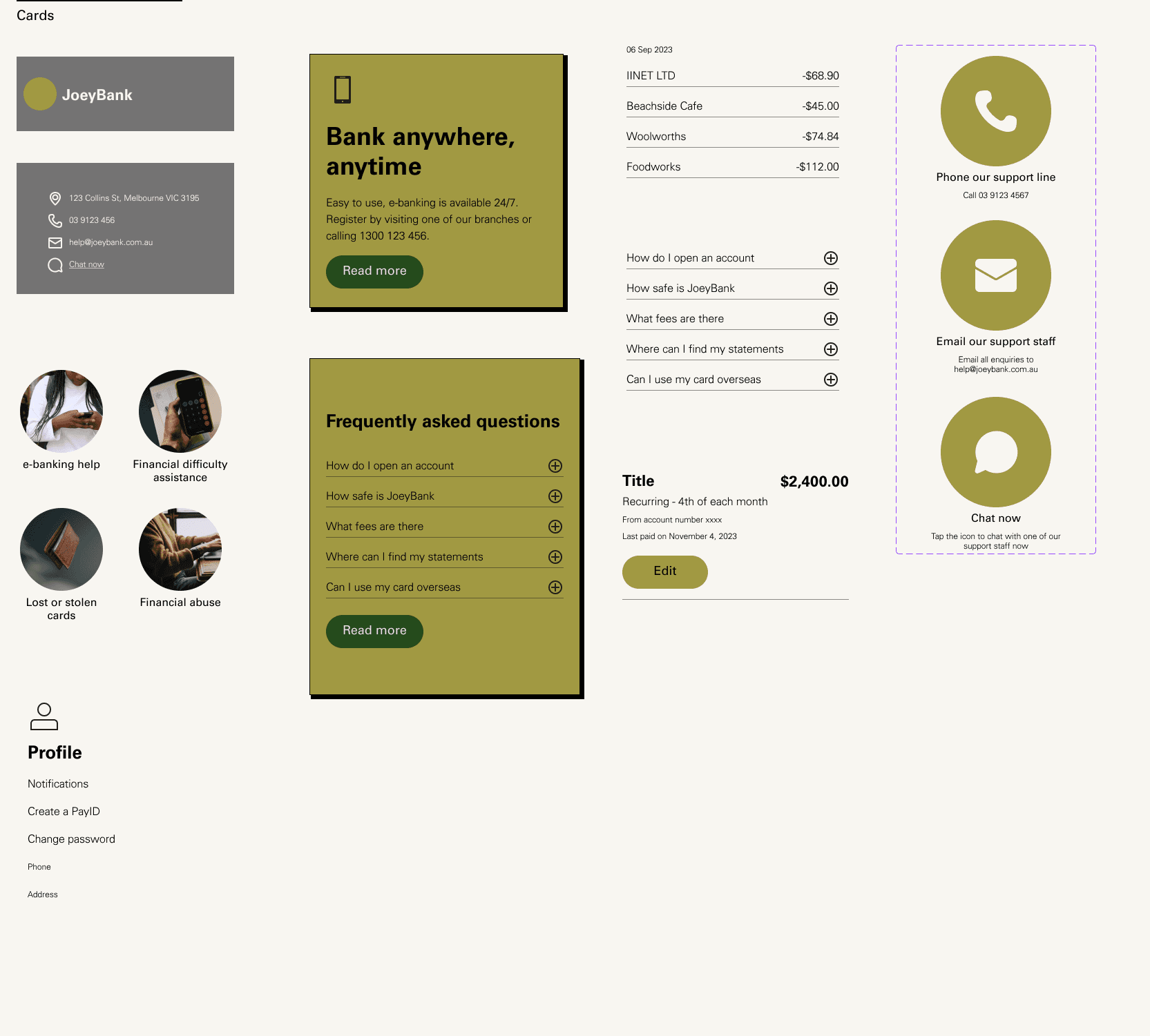
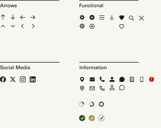
Building a component library.
A component library was built, and medium fidelity prototypes were tested, after much internal iteration. Components and cards were added to the library as the designs became more resolved. I built a custom icon pack for the project.


Designing, iterating, testing, iterating some more.
The pages went through many internal iterations prior to user testing as part of the initial design process. Once these were at a medium fidelity stage, they were taken into user testing, which brought several insights to light - highlighted below.
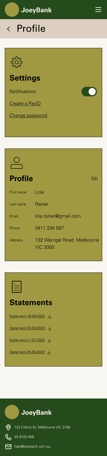

Med-Fi Prototype
DESIGN + ITERATION
*not shown - the countless other design iterations between each of these images
What did the users think?
Focusing on the flows required for the MVP, I got users to run through a few scenarios. I wanted to understand how users intuitively added a new savings bucket, and how they expected each page to behave.
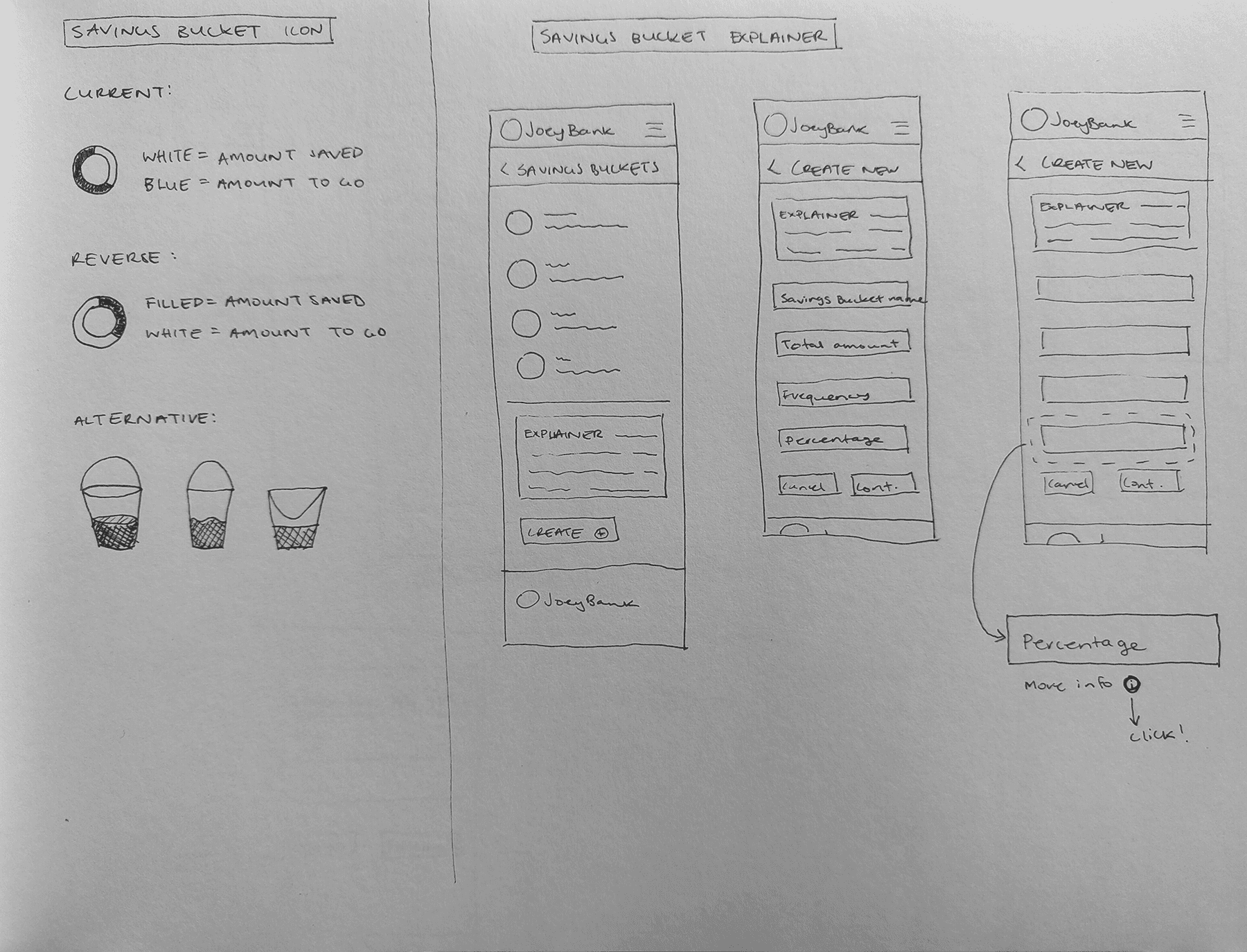
Savings bucket icon unclear
"I misread the colours as full meaning empty and empty meaning full."
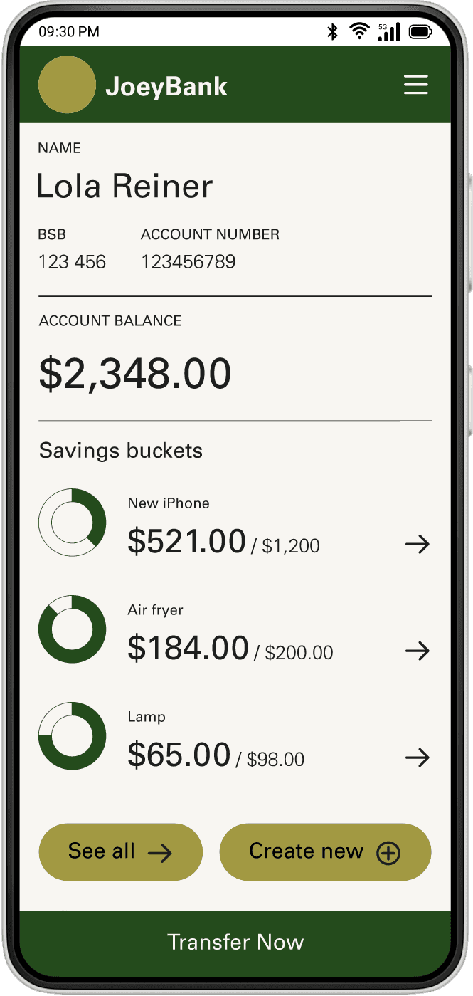
Lack of transfer function on account landing page
"One of the main reasons for using my banking app is to transfer money."
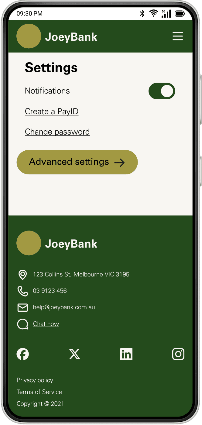
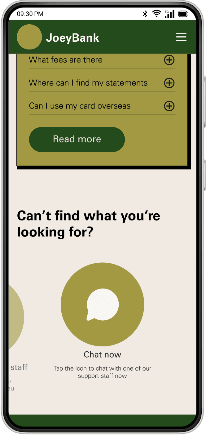
All users wanted an online chat option
"If I can avoid making a call, I will."
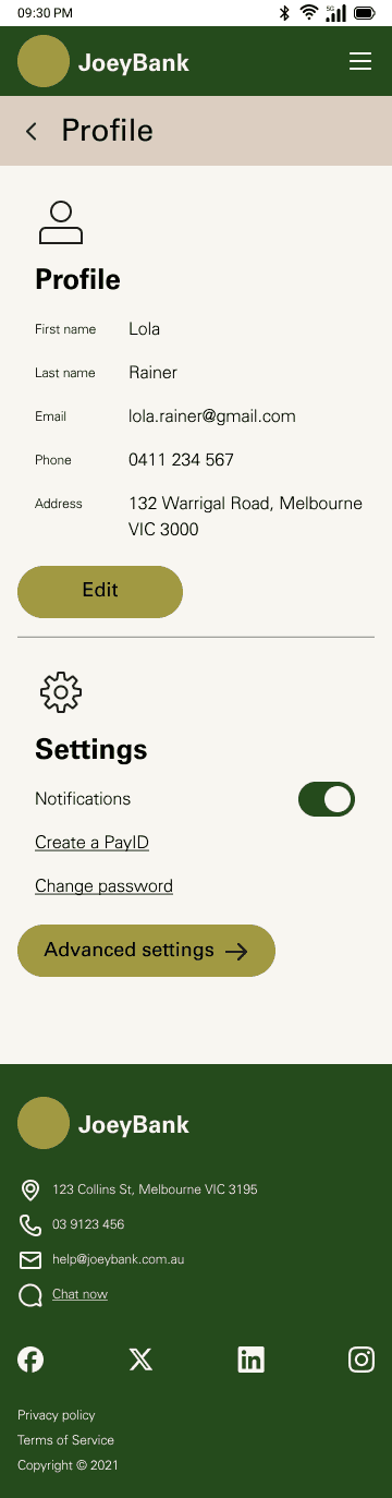
Solution
These key insights sent me back to the drawing board to sketch up some solutions. This allowed me to quickly visualise a few options for each area of focus, before implementing the best of each into the high-fidelity pages in figma.

Outcome
The high-fidelity prototype addressed the insights from user testing, and included all the pages required for the MVP release, along with error, loading, blank and partial state pages.